Wednesday, 2 December 2015

Feedback On The Website I Created


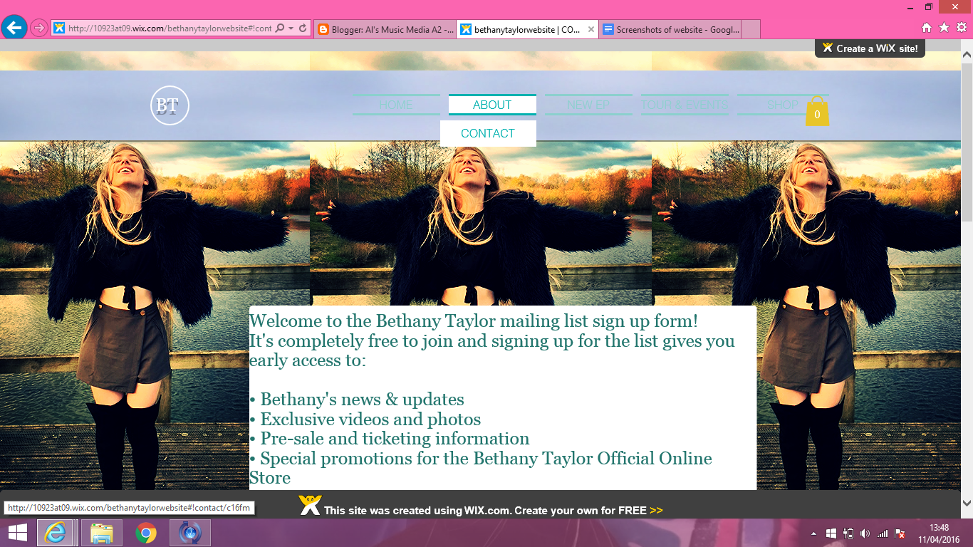
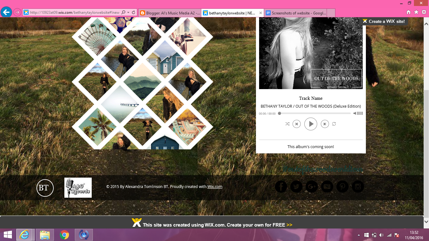
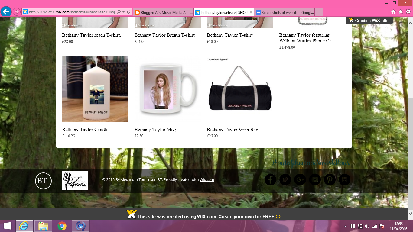
One of my ancillary tasks was to produce a website. When I started producing this website about my artist and I used the site 'Wix.com' to do this. I researched about 5 different artists and all there websites were very unique and different. Wix.com was the best suited site for me to use and I found it to be a very successful choice. When looking at other artist's sites I looked into the different sections and areas they had to their websites. For my website I created a home page, an about page, a contact page,   a new EP, a tours and events and finally an online shop.
Firstly, for the making of my website, I suffered with understanding and finding out where everything was and how to lay each of the unique features out. However, I found it much easier the more I used it the more I was able to customise my site to a higher and higher standard and customize it to my liking. I included moving backgrounds and uncommon aspects that I believed were extremely suitable for my websites target audience and the artist I was doing it for.
I was aware my website needed to look as professional as possible. I did this by using banners at the bottom of every page with consistent text and the record label that I produced on Photoshop. Also, I went on and created banners that have movement within and have used some backgrounds that also have aspects of movement. I did this to make it appear more interesting to my target audience, I wanted it to pop out to them and make them feel that they were looking at a website which was unique ad made me artist look less mainstream and more up and coming.

Below are some screen shots of the website that I created:

Tuesday, 1 December 2015

Ancillary Task- Website

Part of my coursework was to create a website, I was given an ancillary task to do this. This meant i had to create a website for my artist and genre that I have chosen. I have created this website and on it I have included a homepage, an about page, a contact page, a tour and events page, a page for the new EP and an online shop for all visitors.

The link to my website is as follows;(Please take the time to scroll down to the bottom of every page to see all the different features of my website)

http://10923at09.wix.com/bethanytaylorwebsite


Monday, 9 November 2015

Target Audience Notes and Moodboard

Today I had a look at the top music charts on iTunes and via the internet, we can see that pop is a very popular genre of music, if not the most popular. However, the pop genre is not everyone's favorite and isn't loved by all people or age groups as the genre itself is considered 'mainstream'. So in knowing this, I think that pop music is aimed more at the younger generation. Teenagers listen to a lot of chart music also so i believe that although pop is a popular genre of music it is not favored by everyone.
While some of the pop genre artists are aimed at both males and females, I would say that artists such as Taylor Swift, Miley Cyrus and Beyonce are aimed mainly at females while artists such as Coldplay or Maroon 5 would be aimed more at both males and females.
The pop songs themselves may be aimed at those who aren't really 'into' music, suggesting that they listen to radio channels that play pop genre songs very frequently because its fun and easy to listen to (such as Capital, Kiss and Heart). Below is a mood board that I have created to represent the kind of people who listen to the pop genre. I've included friends and family in this to show my range of audience. 

In these photo you can see 15 different people ranging from 16 to 25

Harriet Wood 17
Jess Langham 17
Georgia Westwood 17
Jess Edwards 17
Bethany Taylor 18
Harry Osborne Cooper 18
Mark Hotston 25
Lily Gibbs 17
Luisa De Castro 24
Millie White 17
Maddy Tomlinson 20
Libby Capsey 20
Ben Giles 18
Will Quartermain 17
Helena Pardey-Yaralli 17


Full Lyrics for my Chosen Song

Looking at it nowIt all seems so simpleWe were lying on your couchI rememberYou took a Polaroid of usThen discovered (then discovered)The rest of the world was black and whiteBut we were in screaming colourAnd I remember thinking…[Chorus 2x:]Are we out of the woods yet?Are we out of the woods yet?Are we out of the woods yet?Are we out of the woods?Are we in the clear yet?Are we in the clear yet?Are we in the clear yet?In the clear yet?GoodAre we out of the woods?Looking at it nowLast December (last December)We were built to fall apartThen fall back together (back together)Your necklace hanging from my neckThe night we couldn't quite forgetWhen we decided (we decided)To move the furniture so we could dance,Baby, like we stood a chanceTwo paper airplanes flying, flying, flyingAnd I remember thinkin'[Chorus 2x](Are we out of the woods?!)Remember when you hit the brakes too soon?Twenty stitches in the hospital roomWhen you started cryin', baby, I did, tooBut when the sun came up, I was lookin' at youRemember when we couldn't take the heatI walked out and said, "I'm settin' you free,"But the monsters turned out to be just treesAnd when the sun came up, you were lookin' at meYou were lookin' at meYou were lookin' at me,I remember, oh, I remember[Chorus 4x]

Location Report

I have chosen three different locations for three different filming areas, Mulberries Lake, Hammonds Copse and Headley Heath. For parts of my music video (the ones that require a wooded area), I have had ideas to film it at 'Headley Heath' I think that this area is a good place to film parts of my music video because I feel that it will represent some of my lyrics well and be appropriate as it is a quiet area. I have also decided I would like to include lake scenes at The Mulberries Lake. Below I have included photos of these three ares. 

Test shots of Actors

My first chosen actor is going to be Bethany Taylor and she is going to play Taylor swift (the artist) in my music video. For this test shot, my actor is dressed in smart but pretty clothing to represent my genre and my costume choice well. The simple black dress is very complimentary to her figure and emphasises glamour. My actor also has her make-up done to a high standard, featuring red lipstick, mascara and flicked eye liner on to also represent the characteristics and look of my chosen artist and to make her look like a pop artist. And lastly, she is positioned in front of a natural back drop in the bushes so it also fits into the theme of the woods for my chosen song. She is standing on a pathway which finishes center of the photo. 


This is my test shot for my next actor Will Quatermain that is going to be featuring in my music video. This is Will, and he is going to be playing the only male actor in the music video (Taylor Swift's boyfriend). Will is also positioned in front of a natural background of trees to fit in with my theme of the woods for my chosen song. This actor is wearing casual clothing, which is the sort of style I am going to be using for some of my scenes in the music video to make him look like a typical casual male figure, however I plan on dressing him in smart clothing also, to fit in with the pop genre conventions making him look like he belongs in a pop video. I believe showing him well dressed will emphasize the pop genre. I want him to look just as stylish as Bethany.

Costume and Prop List

When making my music video for my pop genre I knew I would need a costume and prop list. These all need to be things that are going into my filming and being used to enhance my final music video.
Below I have posted my costume and prop lists that are followed by some images to emphasise the final product:

Props:
1. Canopy of fairy lights (to add some light and colour to our scenes involving 'the woods')
2. Polaroid picture (taken of the two actors to use for a shot)
3. A couch in a house (to film a quick shot on)
4. A necklace (for one of the scenes)
5. Glass Bottles, string and flowers

Costume:
1. Casual smart clothing for some shots:- Smart jeans and a shirt, with boots (for the male actor)
while in other scenes, maybe smart clothing (suits?) -To fit with pop genre conventions.

2. Again for the female actor:- Some casual clothes for inside scenes, while dressing in more formal clothing for other shots (dresses, skirts etc.)- again to fit with pop genre conventions of being 'glamorous'.

Target Audience Research

For my target audience research i have created a survey on survey monkey. It is about aspects of the song and pop genre. Throughout the survey I have included questions about personal opinions on my chosen track, this is to help me with my ideas for my music video. I have asked 20 people to fill out my survey.


Location Filming (Ideas)

For my final track selection, I chose 'Out of the woods' by Taylor Swift. I wanted to ensure that i kept the theme of the words throughout the song. I have come to the decision that i want to film my music video in a wooded area as well as home environments and other locations (by a lake etc.).
Below are some moving images (GIFS). I have found these on the internet, I wanted to represent the types of locations which I want to film my music video at. For some of my shots I want to experiment with to set an establishing shot and some photos to emphasise my ideas about lights and sunrises. I want to include time lapses within my music video:


nature landscape october september autumnbeach landscape sunset saudi arabia ksalove black and white dance couples romanticnature forest landscape trees scenery

Digipak Analysis- (Ancillary Task 1)

Digipak Beyoncé 2011 album 4


Text Positioning-
On this album the text used is extremely basic and clean cut. I believe the simple font is really effective and eye catching. The artist and album name is located on all components of the digipak, this is a theme throughout other digipak’s that I researched.  On both the front and back of the digipak’s is Beyoncé’s name, it is positioned top centre. I believe this is to emphasise that she is the artist and that is highly important to the audience. This also keeps a constant house style. The title of the album ‘4’ is positioned in the bottom right hand corner, it is not the focus of the album. This is because consumers are likely to be attracted to the artist name not the album name. This pattern is carried on through other albums, such as MIKA’s ‘Life in Cartoon Motion’. The selection of music is positioned on the right side of the CD and back of the album.

Design Principles-
The rule of thirds is used very effectively throughout the Imagery on the digipak. On the front of the digipak Beyoncé is on the centre but, on the CD and back she is positioned to the back. Placing her in the main focal point, means she is the first thing consumers would see. Therefore this technique is very effective.

Typography Design-
The text used on the digipak is easy and simple to read. The typography is consistent on all components. This bold sans scrif font that has been used for the artist and album name adds to the simple but effective look. All the font throughout the digipak is black. This effectively is a contrast compared to the bland white background used throughout. On the back of this digipak there is a track listing it has been italicized, this also contrasts with the other text used throughout.

Design Principles
Throughout Beyoncé’s digipak the rule of thirds has been used very effectively on the imagery. Both the back and disk photo have Beyoncé positioned on the left, positioning her in the main focal point is a very clever and effective thing to have done. This means it is the first things consumers see, therefore drawing in more customers.


Imagery and Colours

On all three components the imagery used is very similar, this gives a stylish theme throughout. This also give a consistent pop style. This ensure consumers will associate these images with this particular album (4). Throughout all digipaks I have looked at I’ve see one single images of the artist, furthermore this will stand out to consumers and make them more likely to buy the album. The image of B that is used is a low angled shot which looks very effective for a front cover, also the lighting used will attract consumer’s attention. This angled shot implies the artist has power and control over her work. This is further emphasised by the mise en scene used on the back of the image. This is shown through the way she is looking over the city like it is her kingdom. The image on the front also overlaps the artist’s name, therefore showing how much of an established female artist she is. The colour scheme used for this also remains consistent throughout, it is always clear that the images have been edited to have a yellow tone. This makes them more recognisable for the customer. 

Lyric Analysis Ideas


Final Track Selection

I have had to cut down my choices to one song for my final track idea, I have decided on “Out of the woods” by Taylor Swift. I have chosen this track because I believe that I am able to create visual images that will match this track and represent the lyrics of this song in a creative and unique way. This song was chosen off of Taylor Swift’s newest album, ‘1989’. 

Album Cover Analysis (3)


CD cover 3: Katy Perry- Teenage Dream
Front cover:  colours

Pink,  Blue, Nude, Black, White, Red.
Front cover:  image
•           How image  links to band / album name – any hidden meanings?

The  front cover is Katy Perry lying in pink fluffy clouds naked. She has black  hair and red lips. The hidden meaning is that it’s a dream and that is why  she’s in clouds.
Front cover:  fonts (for band and album name, differences)
•           font size
•           number of  characters

The  font on the front cover is candy looking. Her name is bigger than the album  name. The album name font has a dripping effect on it. The artists name is  placed top centre whereas the album name is bottom centre. The parental  advisory sign is bottom right of the album. There are 21 characters not  including the parental advisory sign.
Back cover:  what info is included

The  back cover presents the 12 songs that the album has. A barcode is included  and website and record label are also included.
Back cover:  links to front cover

The  pink clouds and blue sky are carried on to the back. The candy font on the  back is very effective and matches the font on the front.
Spine  information and links to front and back cover
Artists  name and album name ( Katy Perry          Teenage Dream)
Overall, how  does iconography represent the band?
All  the colourful images represent her fun album and how she is a girly singer  and it is all pink. The fun fonts so she is a groovy pop singer.

Album Cover Analysis (2)


CD cover 2: Life in Cartoon Motion- MIKA
Front cover:  colours

Red,  Yellow, Pink, Blue, Purple, Orange, Grey, White, Brown Green.
Front cover:  image
•           How image links  to band / album name – any hidden meanings?

The  front cover is a colourful cartoon cloud with lightening coming out of it in  all different colours. It says MIKA centre left of the album and the title  ‘life in cartoon motion’ is centre right. I feel the cartoons represent  stories and the colour shows passion and enthusiasm.
Front cover:  fonts (for band and album name, differences)
•           font size
•           number of  characters

All  fonts in the front cover are different. This gives a crazy setting and the  colours blue, pink and white are used for the two fonts. The artists name is  large and the album name is small. There are 22 characters across the album  cover.
Back cover:  what info is included

There  are the 11 song that the album contains. The barcode and record label are  also on the back of the cover. Furthermore the web address is on the back.  There are multiple pictures on the right hand side of clouds sofas, TV and  lamps.
Back cover:  links to front cover

The  back cover links to the front cover through its illustrations. The pictures  are drawn exactly the same in a cartoon style.
Spine  information and links to front and back cover
Artists  name and album name ( MIKA      Life In  Cartoon Motion)
Overall, how  does iconography represent the band?
All  the colourful images represent his personality and fun lifestyle as a pop  singer.

Album Cover Analysis (1)


CD cover 1: Sam Smith ‘The Lonely Hour’
Front cover:  colours

Black,  grey, pink and nude.
Front cover:  image
•           How image  links to band / album name – any hidden meanings?

Sam  Smith sat on a white black with his elbows on his knees looking down. He  looks very disappointed and depressed. The album name is ‘The Lonely Hour’,  from the front cover you can see Sam is alone and feeling empty.
Front cover:  fonts (for band and album name, differences)
•           font size
•           number of  characters

The  font on the front cover is very basic and simple. It is a white font placed  centre of the page. His name is above the title and is double the size. I  believe this is to emphasise his importance. There is 23 characters on the  front cover. The word lonely is placed centre of the album.
Back cover:  what info is included

The  back of the album includes the artists name and the title of the album at the  centre top. Below this is the names of the 14 songs the album contains. Below  this is the Capitol records label a bar code and his web address.
Back cover:  links to front cover

The  names of the artist and the name of the album are both centred on the album.  This displays a serious message and the importance of this information. The  writing is white on both and the backgrounds dark.
Spine  information and links to front and back cover
Dark  with white writing.
Overall, how  does iconography represent the band?
The  artist is represented as a very serious singer. It shows that the artist  wants to deliver a very serious important message. You can tell the record  label have helped to make the artist look professional.